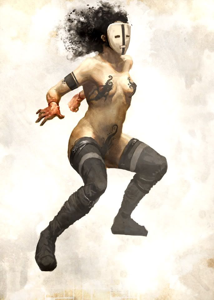
Looking good man. It's getting there. Local colors could perhaps use a little more distinguishing from each other. Tattoo's could perhaps follow the form a little more accurately and softening the edges could help too.
The mask - seems like a cop-out. Let's see a face or a really badass mask.
Maybe define the hips a bit more too - show the bones?
Hey Tom awesome to see you checkin' out our humble lil corner. mmm, you need to give me more crits hehe.
Hear you on the colours, this one's been especially tricky since I worked it from b&w to colour. Definitely following your advice on the tats and edges. Thanks for stopping in man, your advice is deeply appreciated!
4 comments:
Looking good man. It's getting there.
Local colors could perhaps use a little more distinguishing from each other. Tattoo's could perhaps follow the form a little more accurately and softening the edges could help too.
The mask - seems like a cop-out. Let's see a face or a really badass mask.
Maybe define the hips a bit more too - show the bones?
/hardass ( :) )
Hey Tom awesome to see you checkin' out our humble lil corner. mmm, you need to give me more crits hehe.
Hear you on the colours, this one's been especially tricky since I worked it from b&w to colour. Definitely following your advice on the tats and edges. Thanks for stopping in man, your advice is deeply appreciated!
Great form me!
I like the concept. Very nice!
Post a Comment